

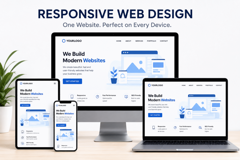
In 2026, customers expect websites to work flawlessly on every device, whether they’re browsing on a smartphone, tablet, laptop, or desktop computer. If your website isn’t optimized for different screen sizes, you risk losing visitors, leads, and sales. That’s why responsive web design has become a necessity rather than a luxury.
A responsive website not only improves the user experience but also supports SEO, increases engagement, and helps businesses stay competitive in an increasingly mobile-first world.
What Is Responsive Web Design?
Responsive web design is an approach to website development that automatically adjusts layouts, images, and content to fit different screen sizes and devices.
Instead of creating separate websites for desktop and mobile users, a responsive design ensures that one website delivers an optimal experience across all platforms.
Why Responsive Web Design Matters in 2026
With mobile internet usage continuing to grow, businesses must ensure their websites are accessible and functional for every visitor.
Key benefits include:
- Better user experience
- Higher search engine rankings
- Increased conversion rates
- Lower bounce rates
- Easier website maintenance
A mobile friendly website helps users quickly find information, navigate pages, and complete actions without frustration.
1. Improves User Experience
Visitors expect websites to load quickly and display correctly regardless of the device they use.
Responsive websites offer:
- Easy navigation
- Readable text without zooming
- Optimized images
- Touch-friendly buttons
- Faster browsing experiences
A positive user experience increases customer satisfaction and encourages repeat visits.
2. Supports Mobile Users
Millions of people shop, search, and browse exclusively from smartphones.
Without a mobile friendly website, businesses may lose valuable opportunities as users abandon sites that are difficult to use on smaller screens.
Responsive design ensures visitors enjoy a seamless experience on:
- Smartphones
- Tablets
- Laptops
- Desktop computers
3. Boosts Search Engine Rankings
Search engines prioritize websites that provide a good mobile experience.
Implementing responsive web design helps improve:
- Mobile usability
- Page experience
- Crawl efficiency
- Overall SEO performance
As a result, businesses are more likely to attract organic traffic and improve online visibility.
4. Enhances Cross Device Compatibility
Customers often switch between multiple devices before making a purchase or inquiry.
Strong cross device compatibility ensures your website delivers a consistent experience across every screen size and operating system.
Whether a customer starts browsing on a mobile phone and finishes on a desktop, responsive design keeps the experience smooth and intuitive.
5. Increases Conversion Rates
Responsive websites reduce friction during the customer journey.
Benefits include:
- Easier form submissions
- Faster checkout processes
- Better call-to-action visibility
- Simplified navigation
These improvements help convert more visitors into customers.
6. Reduces Website Maintenance Costs
Maintaining separate desktop and mobile websites requires extra time and resources.
With responsive design, businesses manage a single website that adapts automatically to different devices, reducing development and maintenance costs.
Many providers of web design services recommend responsive development as the most efficient long-term solution.
7. Builds Brand Credibility
An outdated or poorly functioning website can damage trust.
A professionally designed responsive website demonstrates that your business values quality, accessibility, and customer experience.
First impressions often determine whether visitors choose your business over a competitor.
8. Supports Digital Marketing Campaigns
Whether you’re investing in SEO, email marketing, or paid advertising, your campaigns perform better when visitors land on a responsive website.
Marketing traffic generated through ads or social media is more likely to convert when users can easily interact with your site on any device.
Best Practices for Responsive Web Design
To maximize performance, businesses should:
- Use flexible layouts and grids
- Optimize images for faster loading
- Prioritize mobile-first design
- Test websites across multiple devices
- Keep navigation simple and intuitive
- Ensure buttons and forms are touch-friendly
Professional web design services can help implement these best practices effectively.
Common Mistakes to Avoid
Avoid these responsive design pitfalls:
- Tiny text that’s difficult to read
- Slow-loading images
- Unresponsive navigation menus
- Buttons placed too close together
- Horizontal scrolling
- Pop-ups that block content on mobile devices
Correcting these issues improves usability and engagement.
Industries That Benefit Most
Responsive websites are essential for businesses across every sector, including:
- E-commerce
- Healthcare
- Professional services
- Real estate
- Education
- Hospitality
- Technology
- Finance
Regardless of industry, customers expect a smooth digital experience.
Future Trends in Responsive Web Design
As technology evolves, responsive websites are incorporating:
- AI-powered personalization
- Voice search optimization
- Progressive Web Apps (PWAs)
- Faster Core Web Vitals performance
- Interactive user experiences
Businesses that adopt these innovations will be better positioned for long-term success.
Final Thoughts
In 2026, responsive web design is one of the most important investments a business can make. It improves user experience, strengthens SEO, supports cross device compatibility, and helps create a truly mobile friendly website.
Whether you’re launching a new website or upgrading an existing one, responsive design should be at the core of your digital strategy. Partnering with experienced providers of web design services can ensure your website is ready to meet the expectations of today’s users and tomorrow’s technologies.
Ready to Modernize Your Website?
A responsive website isn’t just about looking good—it’s about delivering exceptional experiences that drive traffic, build trust, and increase conversions. Investing in responsive design today can help your business grow and stay competitive well into the future.
- Implement the best SEO strategies for small businesses UK to improve rankings, attract local customers, and grow your business.
- Understand how site speed affects SEO and optimize your website for better performance and higher Google rankings.
- Improve website speed and SEO together to enhance user experience, increase traffic, and boost conversions.
Related Posts

UI/UX Design Best Practices for Better User Engagement
In today’s competitive digital world, attention spans are shorter than ever. Users expect fast, intuitive,…
Headless CMS vs Traditional CMS: Which Architecture Fits Your Business?
Marketing Directors and Content Managers face a crucial decision: should they continue with traditional CMS…

Common Website Mistakes That Are Killing Your Online Conversions
Are your website conversions not meeting your expectations? It could be due to common website…

Top web design trends 2026 for business success
Your website serves as the ultimate digital storefront for your brand. User expectations are shifting…